cloud platform redesign

Intro
The product is a large-scale cloud services platform, where users can purchase cloud servers, virtual machines, as well as SaaS, PaaS, and other solutions
Developers
Lead Product Designer and Concept Designer.
2 months (first step)
Problem & Goals
For years, the platform relied on a Material Design visual language dating back to 2010. As a result, the UI became outdated and cluttered with layers of new functionality added over time
The design goal was to simplify the visual interface and refresh the design system, while keeping the existing functionality intact and do the main process screens
One of the key challenges was limited access to users — feedback arrived with a delay of about a week. The project began without a front-end developer, working only in collaboration with the product owner
Discovery & Research
At this point, we gathered user insights through 20+ support ticket, which helped us identify interface areas that could be simplified or removed. Findings from the ticket analysis were later validated by a focus group, confirming the key pain points and opportunities for streamlining the UI.
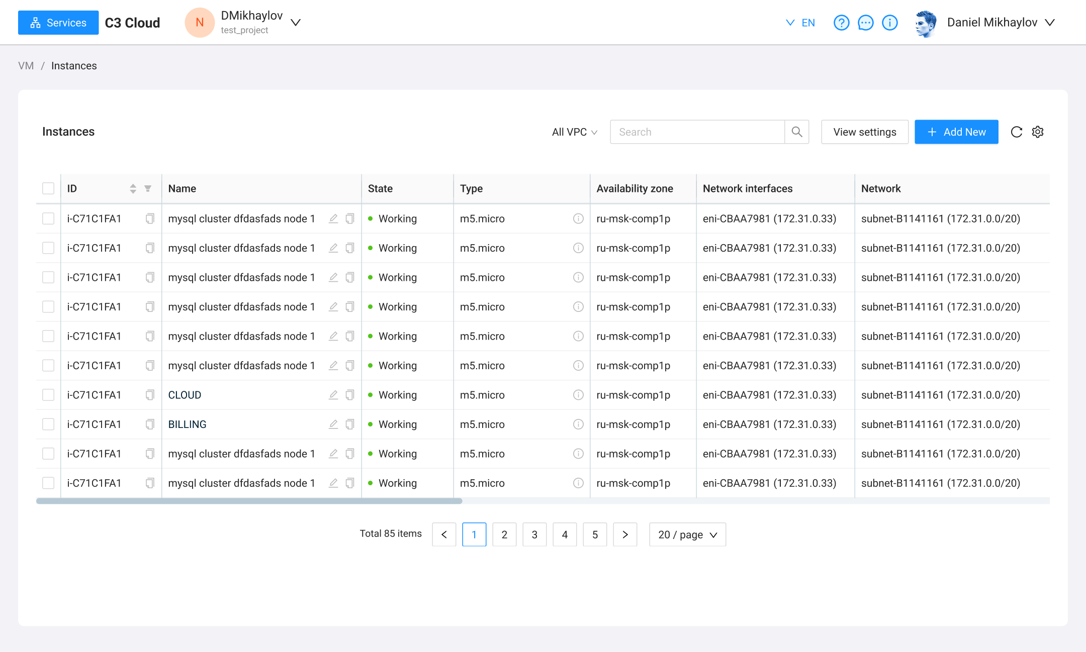
- Overcrowded button area above data tables
- Navigation menu felt disconnected from the rest of the interface
- Excessive horizontal scrolling made key data hard to access
- Core product creation flow was placed in a modal window — not ideal for a complex process
- Too much unused whitespace
- High number of repetitive UI elements — needed better grouping and hierarchy
Design System
Approach
The design process was iterative.After completing a few key pages, we presented them to a focus group composed of the platform’s active users. Their feedback played a critical role in validating our decisions and shaping further iterations.
Solution
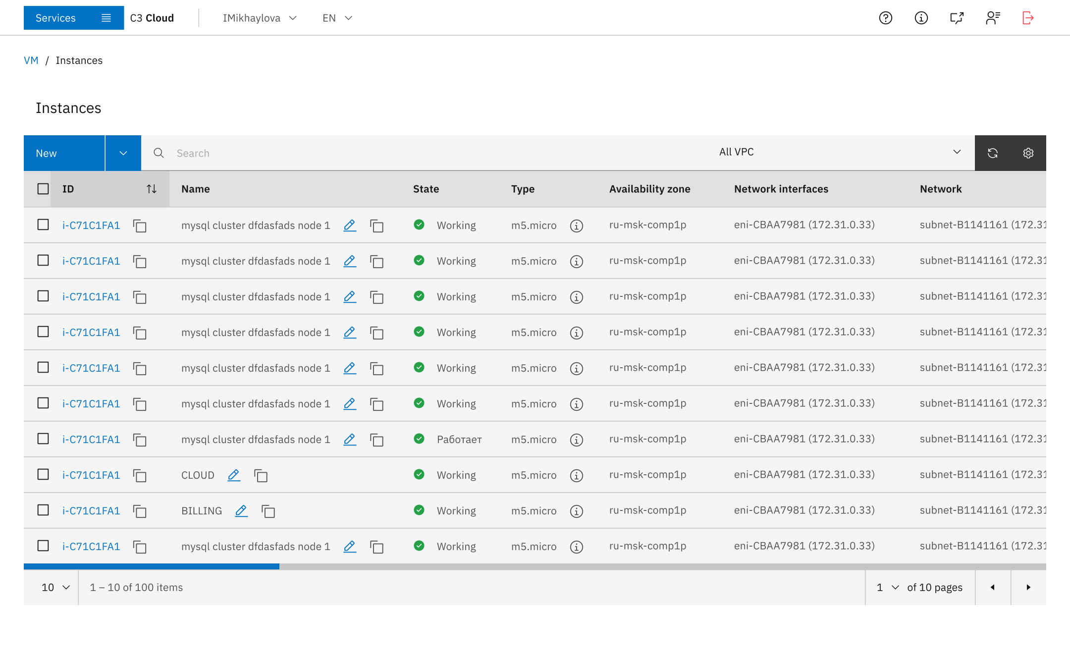
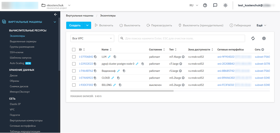
- Row actions were hidden by default and only revealed when a row was selected — reducing visual noise
- Clean, minimalistic icons improved readability and alignment with the platform’s technological feel
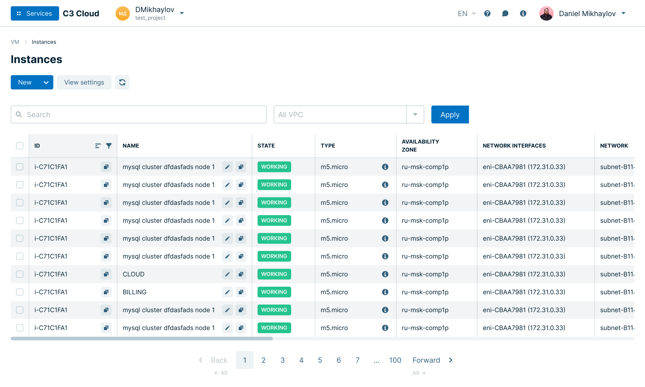
- A full-width table layout allowed more information to be displayed at a glance
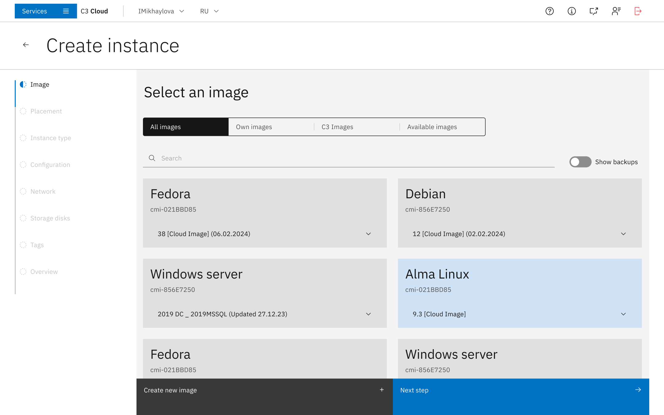
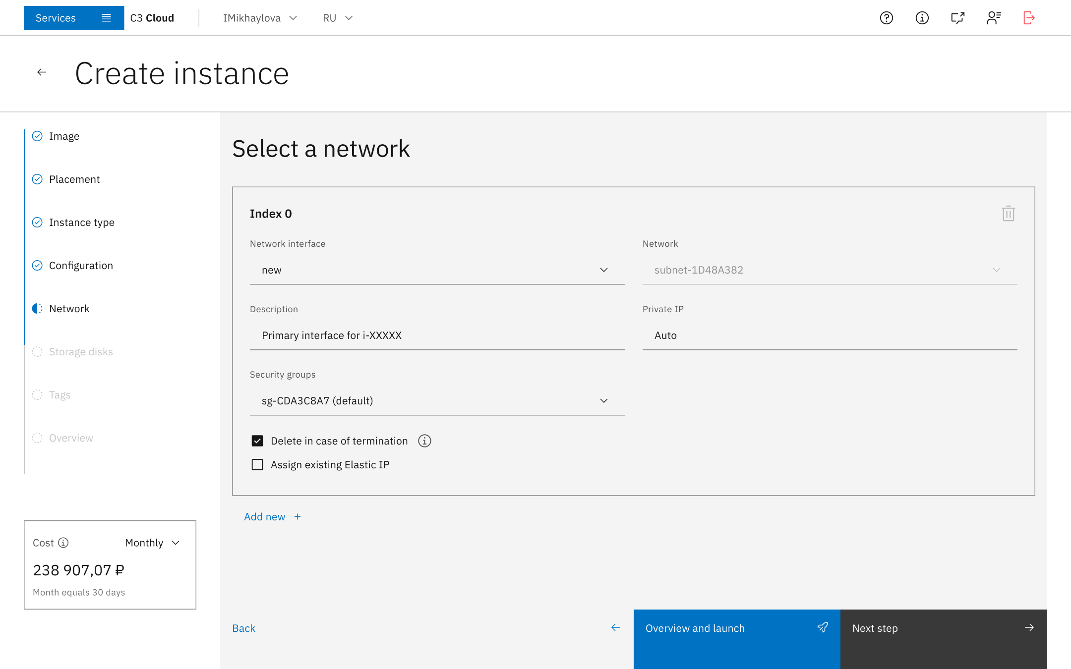
- Instance creation was moved to a dedicated page, improving clarity and reducing cognitive load
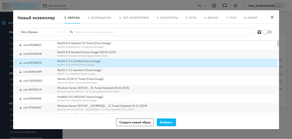
- Images were grouped by operating system, making search faster and more intuitive
- A clear headline to help users understand the purpose of the page
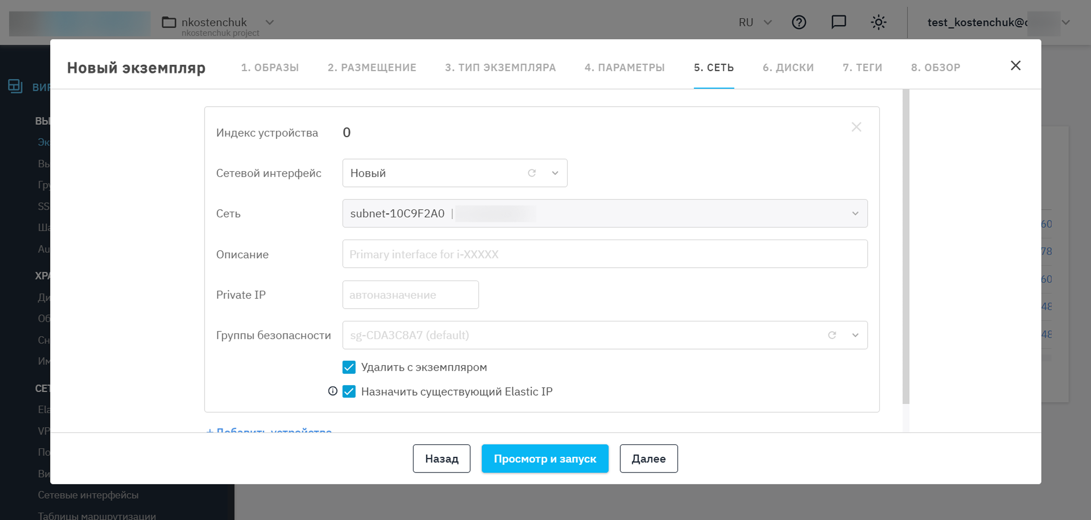
- Network selection grouped into a dedicated container for better structure
- Enlarged, color-coded buttons for better visual hierarchy and ease of navigation