secrets storage

Over 20K
Developers
Lead Product designer & Concept designer
1 Lead Product designer (me), 1 Product designer, 1 Product owner
May 2024-Jul 2024
Carbon
Challenge
For years, the platform relied on a Material Design visual language dating back to 2010. As a result, the UI became outdated and cluttered with layers of new functionality added over time
As a development-driven product, designs couldn’t be implemented strictly according to testing results. Finding the right balance required close collaboration with the development team to propose feasible, high-quality solutions through compromise and iteration.
Design goal was to create missing user screens to enable full workflow support, followed by interface analysis and field testing aimed at improving speed and efficiency for yard operators.
Discovery & Research
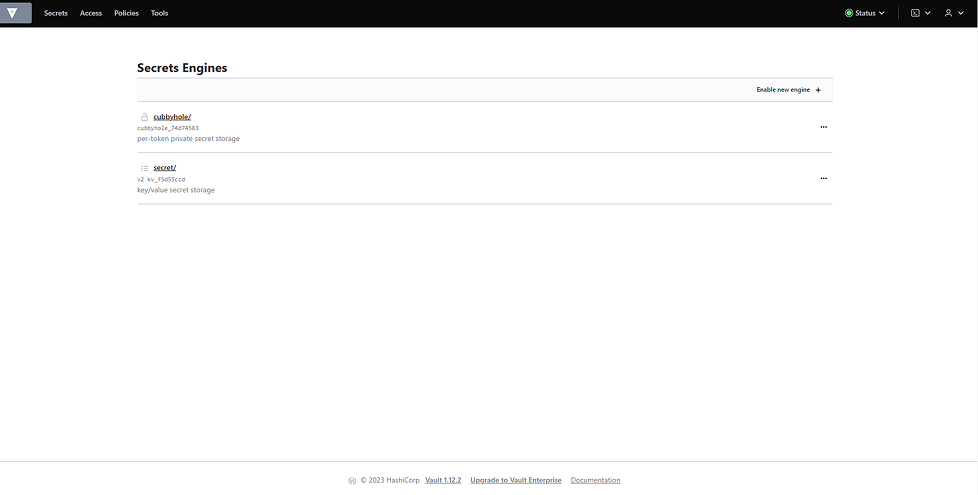
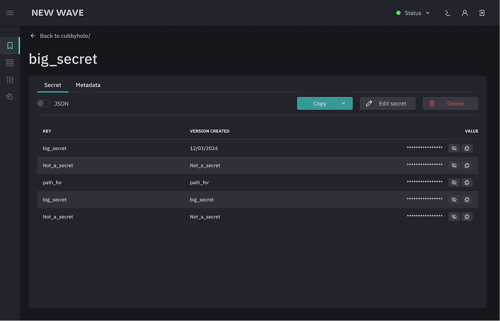
I had tight deadlines and a small team, so we went with an open-source approach. After talking to a 4 engineers, Vault came up as the go-to — so we used it as the base for the new product.
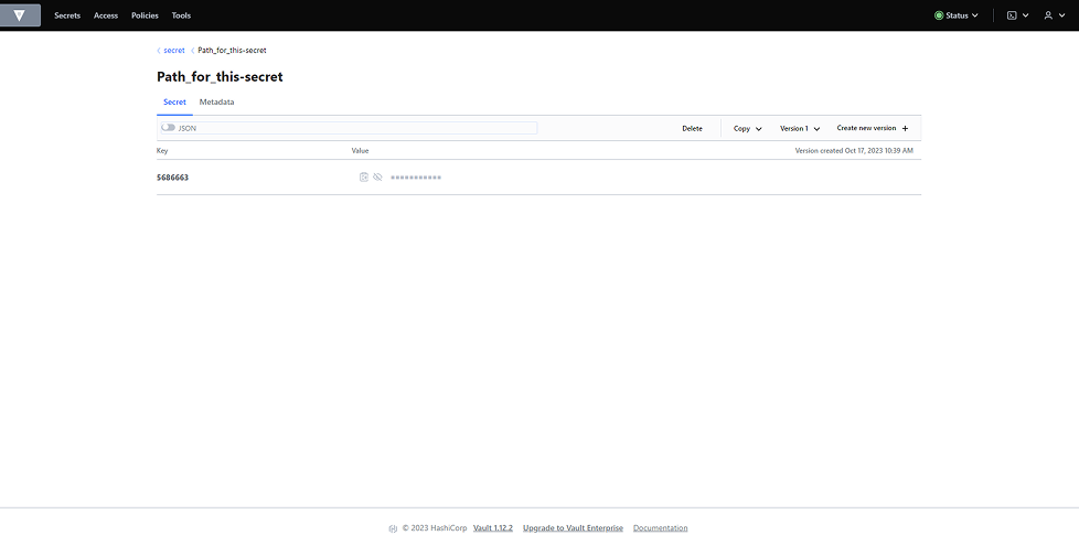
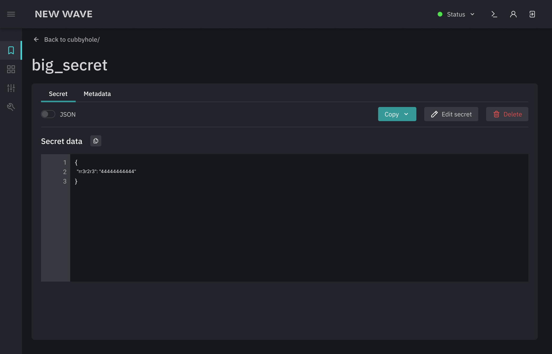
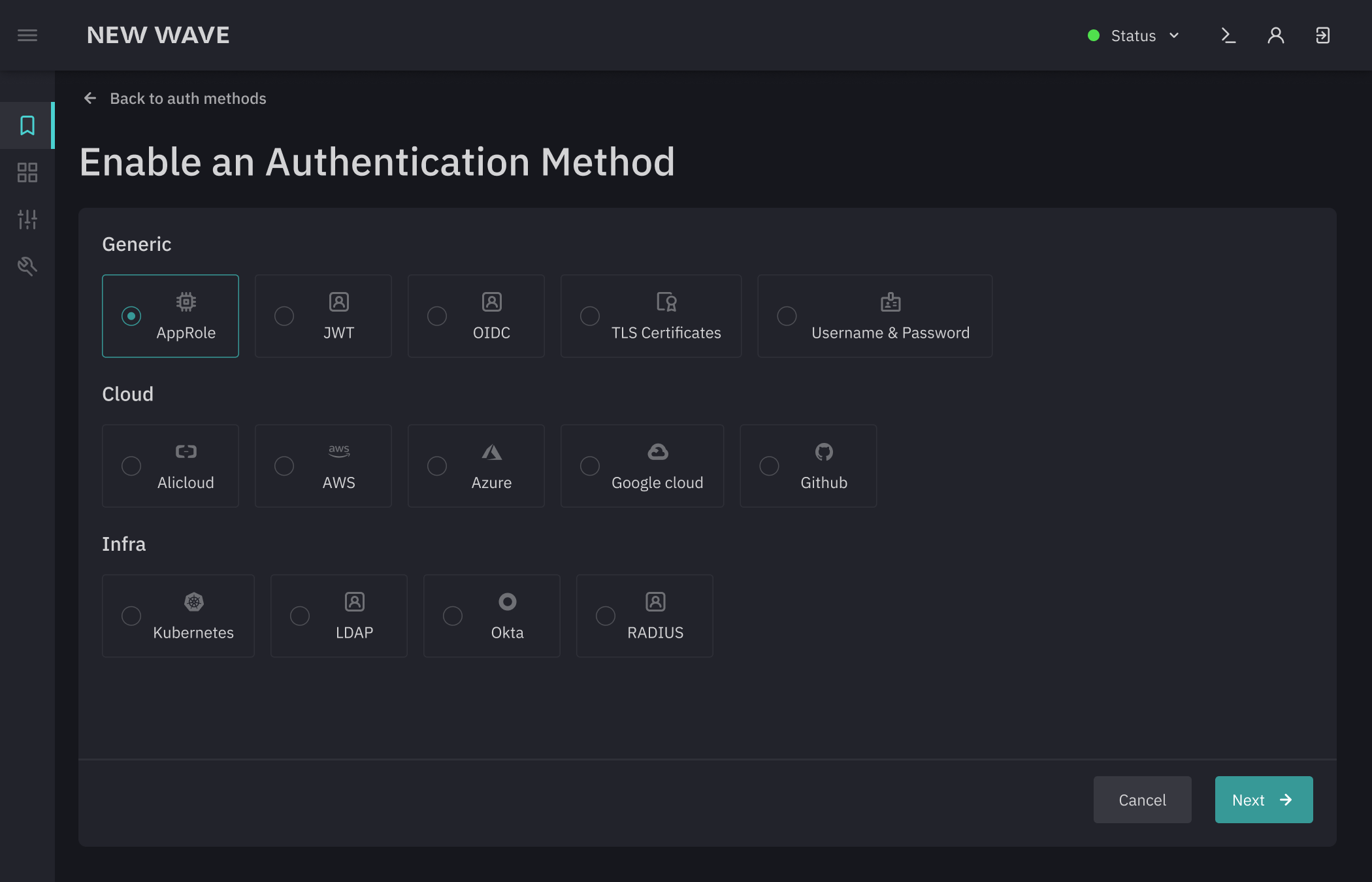
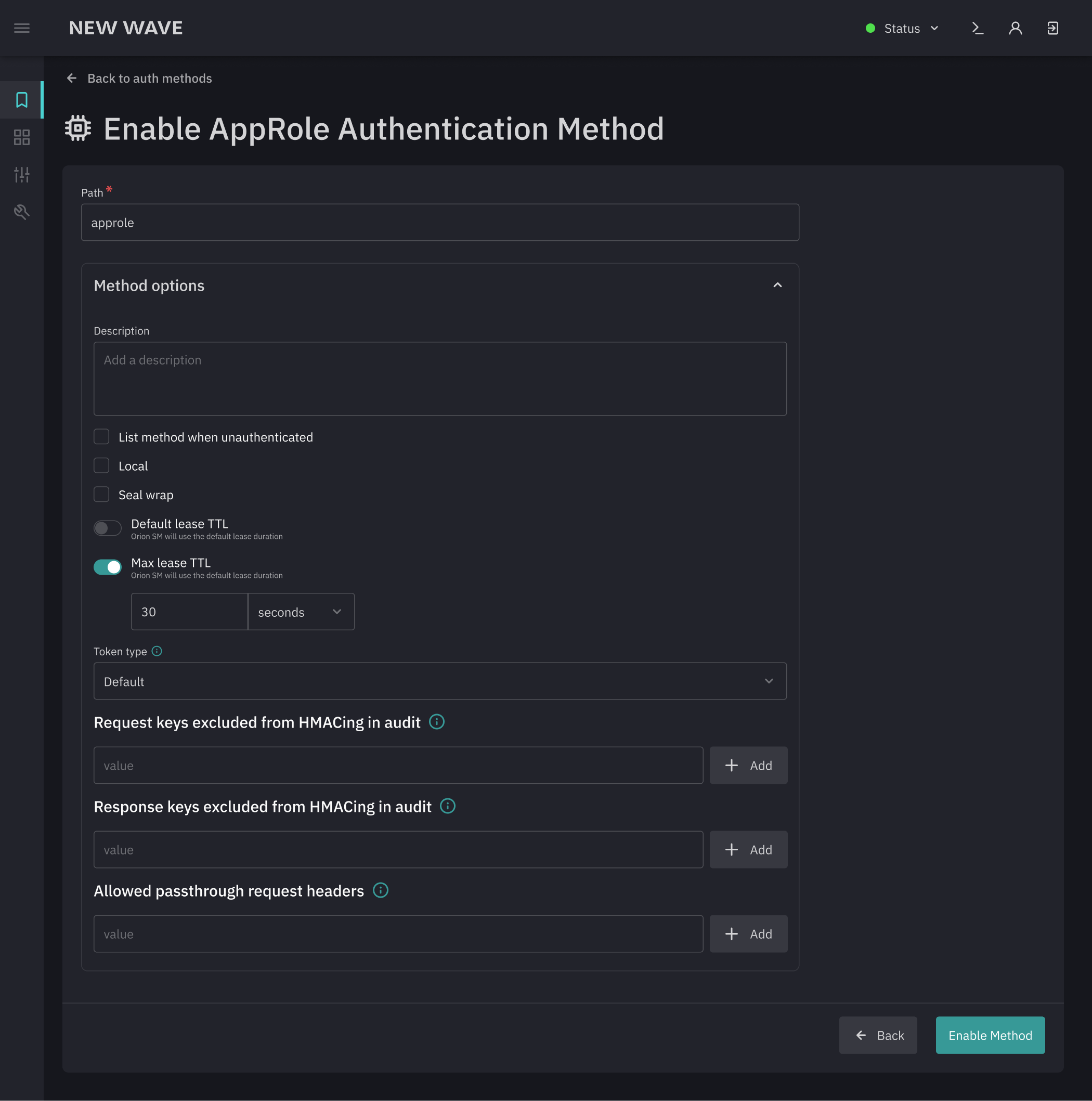
The Vault
- Excessive empty space reducing content clarity
- Unintuitive list filtering, making it hard to narrow down results
- Low-visibility «create» actions within lists
- Unclear entry points for editing existing content
- Outdated user interface that doesn’t meet modern standards
- Light theme mismatched with the product's context and usage scenarios
Priorities
Approach & Process
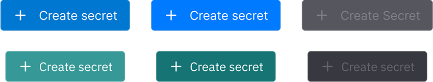
To align with the main platform’s branding, a dedicated color palette was developed for the new product based on the core platform colors.
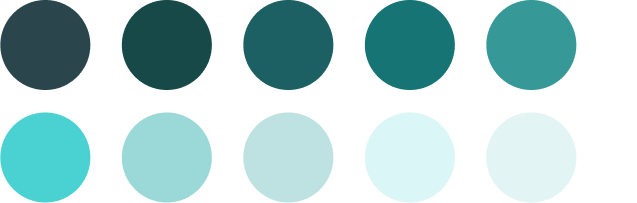
To save development time, the design was based on the Consta design system, with a fully customized color theme applied to maintain brand consistency.
First screens
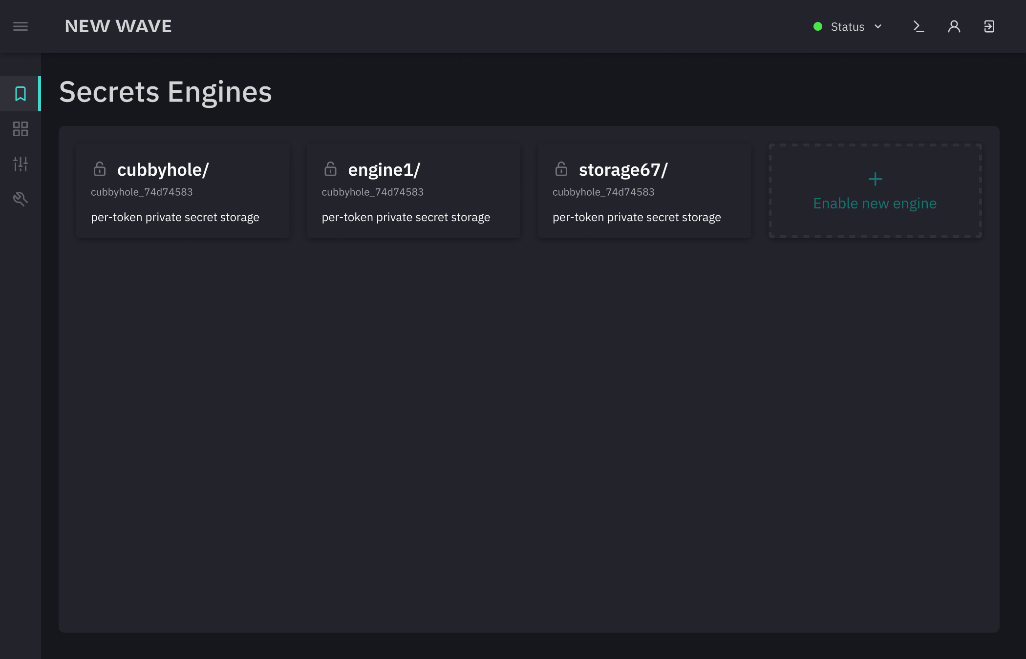
Solution